| About... | |
| Tools... |

Key elements of the D3E document discussion interface:
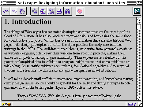
Output of the D3E toolkit from a standard HTML document. On the left is the Article Window, on the right the Commentaries Window showing the top level outline view of discussion about the document. Key: [1] Comment icon embedded in each section heading: clicking displays section-specific comments; [2] active contents list extracted from the section headings; [3] print versions as HTML and PDF; [4] numeric or author/date citation automatically linked to corresponding reference in footnote window; [5] a reverse hyperlink is inserted for each citation of a reference; [6] in the context of an eJournal, an editorial note has been inserted to draw attention to an issue in the author-reviewer debate associated with this section; [7] section-specific review comment; [8] an editorial comment has been inserted summarising the review discussion and specifying change requirements. (Note that there are two versions of the user interface: one as shown, and for smaller displays, the document and discussion are placed in separate browser windows.)(Note that there are two versions of the user interface: one with tiled windows as shown, and an overlapping windows interface for standard displays).
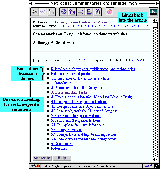
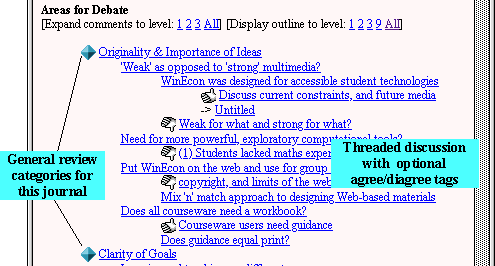
Structure of an article's automatically generated discussion space:


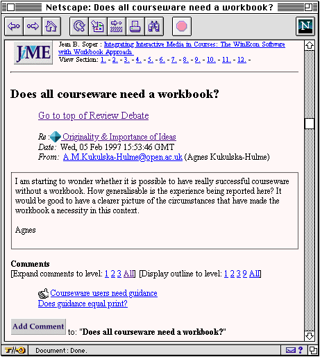
Viewing a comment and responses to it:

Any D3E environment provides two kinds of information of interest: the article, and commentaries about it. The D3E Toolkit generates two versions of the user interface for readers to choose the best one for their display: articles and commentaries can be either displayed in two separate windows (Overlapping Windows Interface), or in a large single window (Tiled Windows Interface).
Tiled Windows Interface: With a display size larger than the basic 640x480, (e.g. 832x624 resolution upwards), readers can take advantage of the Tiled Windows Interface, as shown above.
On a smaller display the frames will be narrower, but you can adjust the vertical divider left or right to see more of the article or the commentaries.
Overlapping Windows Interface: The document shown above looks like the screenshot below through the Overlapping Windows Interface. The front window contains the Contents+Article, and behind it is the Commentaries window. If using the Overlapping Windows Interface, we recommend that readers arrange the Article and Comments windows as illustrated below, so that both are at least partially visible. Readers can (i) easily flip between them with a single click, and (ii) see when their content is being updated.
| About... | |
| Tools... |